Gold Earrings, Calabashes & Cowries! Inspiration for Jewel By Lisa’s Spring/ Summer “Fula” 2013 Collection Campaign
Posted on Monday, February 4th, 2013 at 4:34 PMBy Jennifer Obiuwevbi
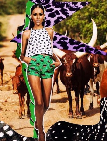
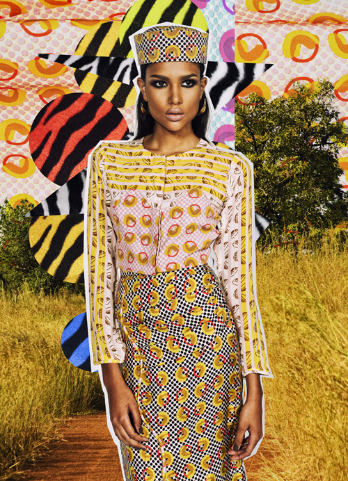
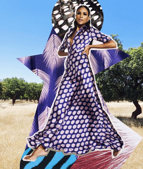
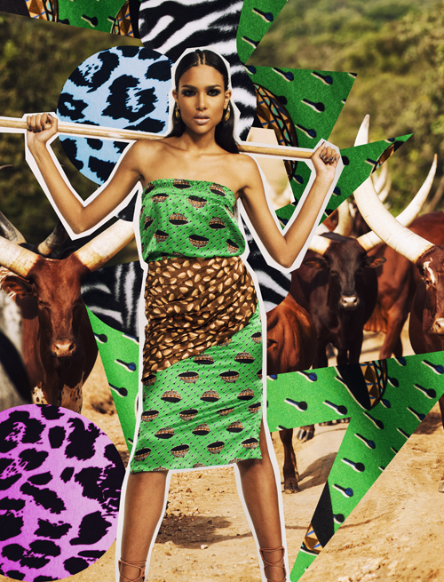
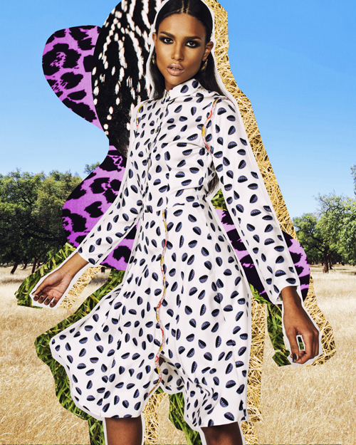
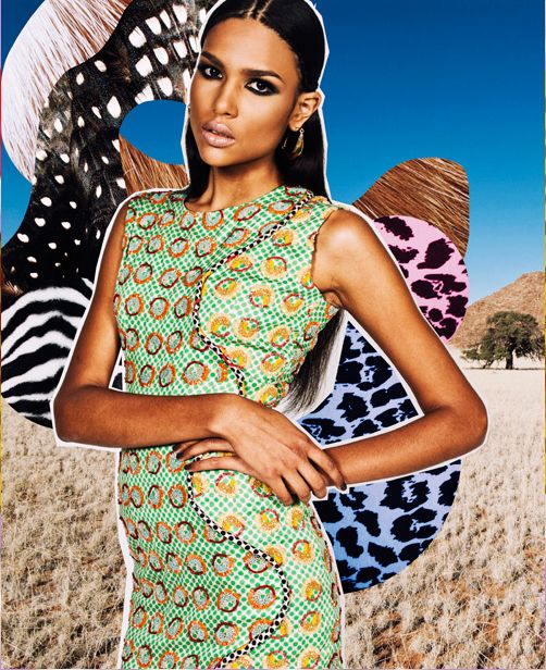
“Wear your earrings on your body” this statement captioned to the image of one of the Jewel By Lisa pieces on Instagram was put into literal translation in their Spring/Summer 2013 “Fula” collection.
The collection campaign showcases a labyrinth of patterns and colors that are typical of the Fulani culture of Nigeria using calabashes, earrings, cowries, wooden spoons, the traditional native cap of the Fulani male and even the stick used to herd their cattle artistically represented on the fabric. The model used in the campaign had her hair weaved like that of a typical maiden from the North, with a braid running along the center of her hair, complete with gold hoop earrings and dark eyeliner.
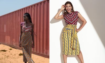
Made from silk fabric, the collection was showcased at the Lagos fashion and Design Week 2012, in which the models wore themed shoes with gold embellishments and shoes made from cowrie-patterned fabric.
The collection campaign employed eccentric graphics that clearly show the artistic and detailed pattern and how the designs were derived for this collection. Chic and pleasant, the Jewel by Lisa Spring 2013 collection has embodied the African culture fusing it with modern design that stands out.
Tags: Fula Collection, jewel by lisa


colourfull
Well done to the team behind this. I am a fan of Poodle Pusher and they did an amazing job with the Fulani inspired styling. Coming up and interpreting this concept is inspiring and refreshing. Very well executed! I know some people are already developing their own interpretation of this. JBL and her team are always pushing the envelope and starting trends for many others to follow.
I am proud of our genuine established designers and up and coming designers. Bigger opportunities for each of them from this year onwards.
wariss this??
Ouch sorry i really want to say something nice but the background is an epic FAIL, it’s all too busy for the eyes and i really had high expections after reading the first line.
As innnn. Bold and beautiful. One day we will realize that we are beautiful.
I love the JBL Label but seriously what is this? Its distracting. A case of too much is much more.
great designs but the background is too busy hence distracting.
lifethroughomaseyes.blogspot.com
This girl is overrated honestly.
I love the Fulani theme, can’t wait to see how they interprete it in the new collection.#FAB
anemistyle.blogspot.com
The images are from the new collection so you don’t have to wait at all.
Love the theme and looking forward to the collection. #FAB
The background is a close up of the pattern design on the fabrics. As in the theme is Fula and the patterns incorporate the theme into the patterns. JBL is being extremely innovative here..
I love. The concept but i think the fashion is not strong enough for the back drop and somehow the clothes get lost. All that stands out is the model. Good concept still, maybe stronger pieces.
I get the concept they were going for.But it simply did not work!
I love the artistic spin on this. But I do not get Fulani from it. I get art, I get creativity, I get individuality, but I do not get Fulani from it. When I think of Fulani: I think massive gold ear rings, face indigo, leather, tiny cornrows, nose rings, belly chains, fulani beads, kaftans, embroidered robes, henna, straw hats, anklets, turbans, earth and gourds.. none of which I see in this.
Is Fula something to do with Fulani culture? If so that sounds cool!
Yahaya
London, UK
the-white-list.co.uk
I like
It’s not bad but it just looks like a juvenile project to me and maybe too busy. Cool colours though but I don’t see anyone copying it abeg lol
This is Brilliant and innovative. Well done to all
Well done JBL, I’ve never seen your team shout on fb as some local tailors with lack of exposure do. i have seen your brand internationally kudos girl…anyway empty barrels are the loudest as the saying goes
i get the main idea but they could have done a much better job. Too jarring to the eyes. They get an E for effort
i can’t see d designs, d background is very distracting
Lovely.
thebanquethall.blogspot.com
Well its good .
I think the designs might be gorgeous and bold, but it is a little hard to tell when such busy-ness and boldness is outlined by such busy-ness and boldness. I think contrasting backgrounds would have worked better, perhaps picking one color from the fabric or contrasting the clothes against a stark screen. The showcasing of the designs is poor, its a good idea, maybe for monochrome designs, but in this case its detracted from the designer’s designs.
I quite like this lookbook. It’s bold and attention grabbing and while it probably reads ” youth” more than luxury, it looks fun. I’m not crazy about this collection as a whole, but the blue/purple dress with the feathery print is drawing me in.
I get art from this collection and I think the diverse reaction to the collection is a testament to the art.
there is a DAM difference between a LOOKBOOK & Campaign, this is their Campaign!!!!
UNEDUCATED IDIOTS!!
Catchy.