Scoop
XPloreNollywood: Best & Worst Nollywood Posters of 2016
What attracts you to a film? Is it your expectation? Or seeing your favourite actor or actress? Or the film posters?
Movie posters are generally (and often times) considered to be art. As the first attempt by filmmakers to market their work, it is and should be a very big deal. However, with technology, photoshop, and the likes, graphic designers need to seize the opportunity to make poster history for some of our movie productions. Alas, that is not the case. For people that run one of the largest creative industries in the world, I believe movie posters should be artistic and rendered in a teasing way to garner viewers to the cinemas.
For the ‘Best & worst Posters of 2016, we will be considering layout, graphic design, overall aesthetic appeal to form the opinion on whether these posters did the movie justice or not!
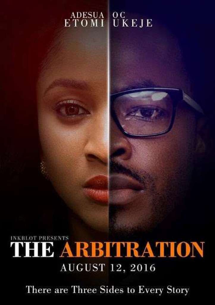
The Arbitration
The Niyi Akinmolayan flick tops our Best movie posters list. The perfect blend of both faces, does everything a poster should do, which is create a level of intrigue without giving anything about the movie away. Now it does share some similarities with the Hollywood movie ‘Face-off’; however, the fact that it’s male and female and there is a play with light adds a difference to its Hollywood counterpart.
WORST
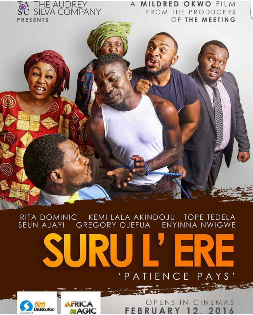
Suru ‘Lere
The Audrey Silva Company – the duo of Rita Dominic and Mildred Okwo are the brains behind this movie. For this poster, I am not so sure. There is a story here, like people have said; but does it have to be so obvious? The poster gives away the plot, so maybe they were not looking to intrigue us. The poster for the trailer was okay, but our contention isn’t the trailer or character posters.
BEST
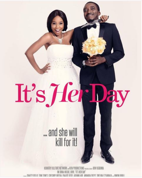
It’s Her Day
The first comical production from comedian Bovi had such a sweet look to it. I’m not sure if it was the wedding dress or the smirk on the face of the groom (Bovi.) This poster had a simple concept, as well as a good tagline. I can say the same for the other poster concepts that were released. However, this takes the cake for concept.
WORST
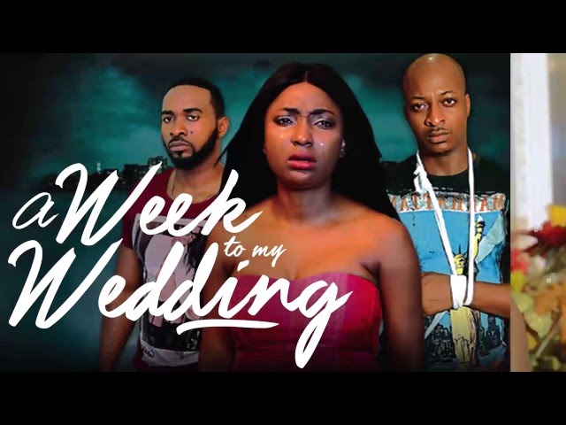
Week to my Wedding
I’m not sure if this was a poster or the movie jacket? Whatever it is, nothing screams I didn’t give this much thought than having the name of the movie smack in the middle of the image. What can I say? Two men and a lady crying, says reeks of despair. Does it have to be that obvious? Let’s not get into that background that looks like a studio curtain and the characters photoshopped look!
BEST
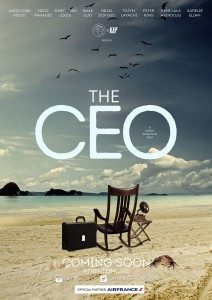
The CEO
Award winning director Kunle Afolayan lost me with his 2014 October 1 poster, but I am glad he picked it up in 2016. With a simple, yet intriguing look, the poster just shows a rocking chair at a beach (so not really the place you will see a rocking chair) with a suitcase, a gramophone. Wait a minute… is that a crab in the background? As an act of marketing, it completely works.
WORST

Ghana Must Go
Nothing says more than having the Ghana must go bags in the poster – as well as the inverted commas in the bag’s material! *sigh*
The poster is simple, don’t get me wrong; but is simplicity all we really want? We understand the poster is attempting to show the differences between Ghanaians & Nigerians but why are the bags there? Are they meant to throw us off completely?
BEST
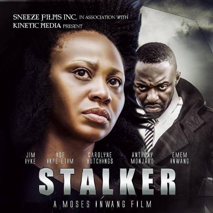
Stalker
So I am a sucker for thriller and once they are conveyed right, they leave a certain eeriness that one cannot fathom. When characters communicate emotions through pictures what more will they do when they are in the actual production? Moses Inwang’s Stalker poster wants us to answer that question. This poster triggers interest in the easiest way movie posters are supposed to. Although the photoshop look on Nse is quite obvious, I like that mirror/reflective look that they tried to portray.
WORST
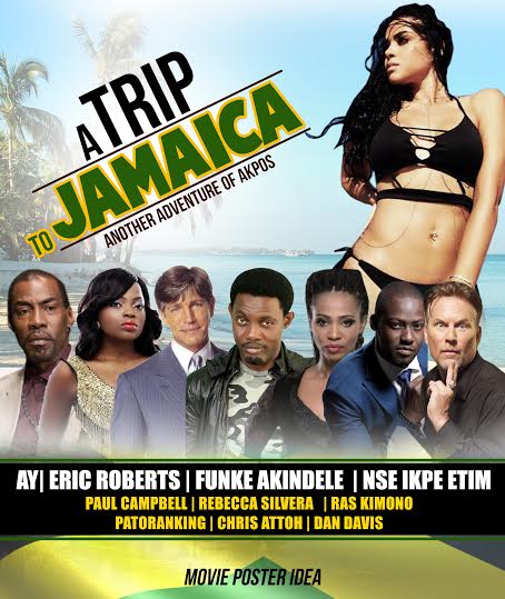
A Trip to Jamaica
So AY had received the short end of my stick for the poster of 30 Days in Atlanta where it felt like he and Ramsey Nouah were about to take a sh*t on the cover. This time, the poster is a profusion of unbelievable images mashed together to produce one look. We have the island look in the background, the plane which has taken off, the palm trees and then the hotel and then the characters at the bottom. Did someone really think this stuff through?
BEST
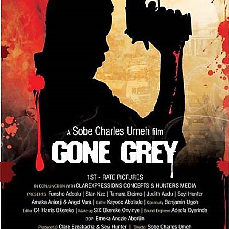
Gone Grey
While this poster seems like one that has been seen over and over, I just can’t get over the use of paint with an infusion of an actual image to bring the poster to life. It also has that feeling of mystery, as going grey doesn’t necessary mean bad, but something in between. I appreciate the direction the graphic artist was trying to accomplish.
WORST
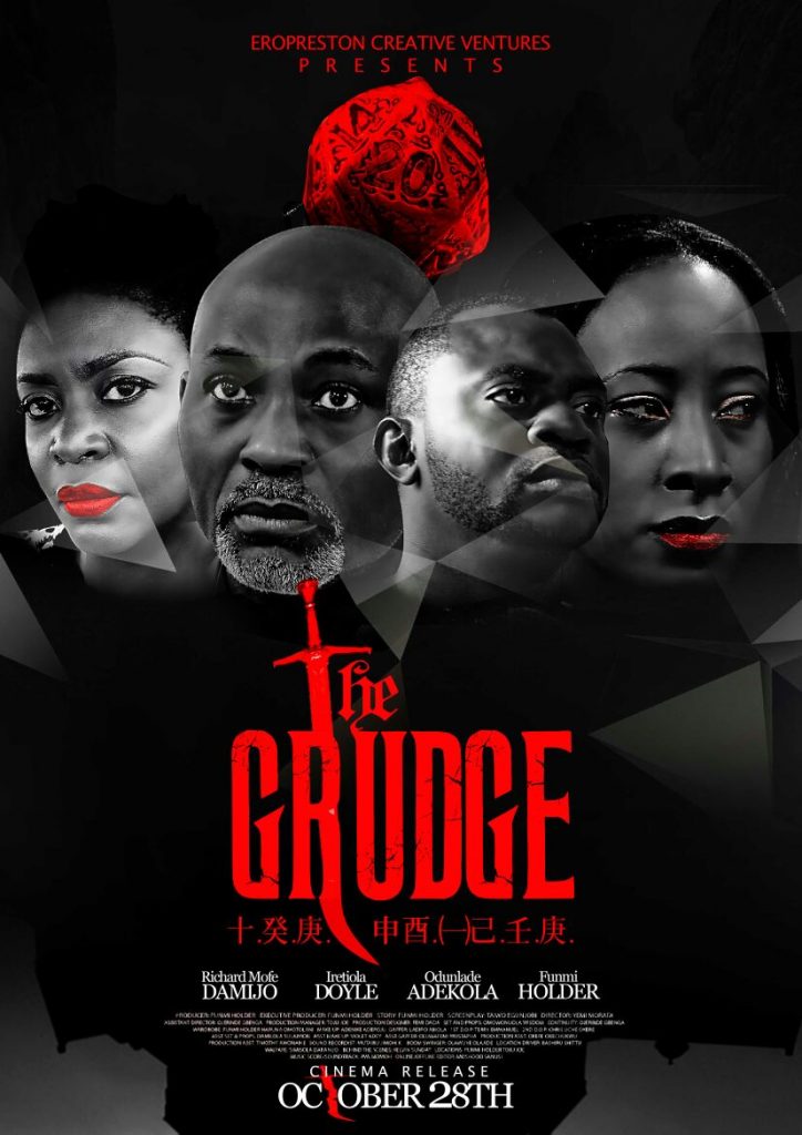
The Grudge
What can I say? Whichever variation of the flyer that was adopted, didn’t feel like anything special or out of the ordinary. Where do I start from? Is it the red rock above the cast members’ heads that’s supposed to be a balance for the red title font at the bottom? The photoshop of the faces together or the red lips of the ladies? Whichever way we look at it, this graphic artist doesn’t do much to help his case or that of the movie, and as such makes it here.
What do you think? Have I missed out any ‘Best or Worst’ movie poster in the line-up? Share your thoughts in the comments section.